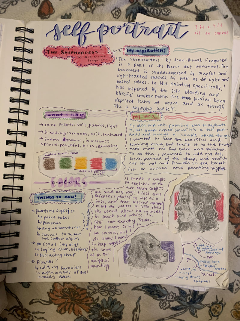
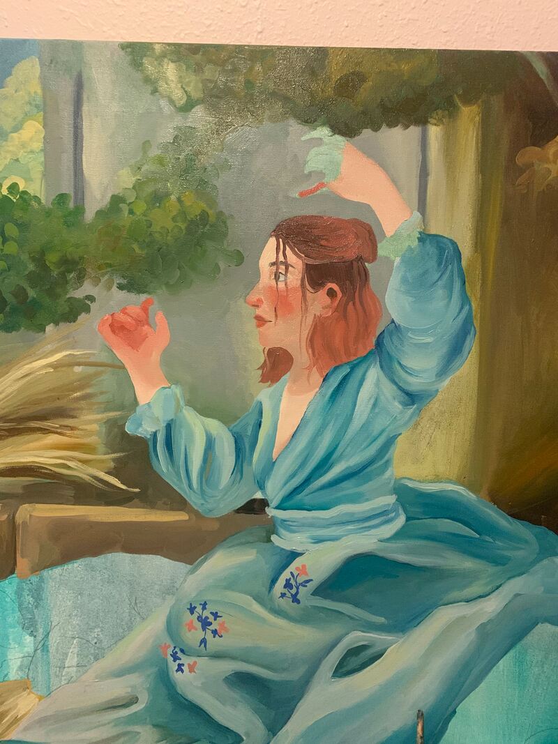
Self Portrait

|
Title : Self portrait
Medium : Oil paint Date : February, 2022 Size : 3 ft x 4 ft Exhibition Text :
This piece was created to reflect upon the things that make me feel calm and peaceful. It was created using oil paint on canvas and was inspired by the painting "The Shepherdess," by Jean-Honore Fragonard. I wanted to replicate the blissful scene in the original artwork, but replace some of the elements with my own things to create an environment that is peaceful and happy for me.
|
Inspiration :

My main inspiration for this piece is the painting "The Shepherdess," by Jean-Honore Fragonard. I first saw this a couple of yeas ago in the Milwaukee Art Museum, and for some reason, it just always stuck with me. I really love the soft color palette and smooth blending, as well as the gorgeous environment that the figure is in. I also really love the fabrics, and how they all have an incredible sense of depth and dimension, clearly showing the form of the dress and the woman wearing it. As for the artist, Fragonard was a French painter and print-maker, working as a part of the Rococo movement. This movement often depicts light and playful scenes, with themes of nature, youth, and love, among others. These are shown clearly in this painting, with the woman being surrounded by nature, playing with the branches, and laying with her sheep. There are a lot of aspects in this painting, as well as the Rococo movement as a whole, that I love and want to show in my own work. For one, I love how soft and serene the environment looks. Everything surrounding the woman is peaceful and quiet looking, with nature all around. She is sitting with what can be assumed to be her sheep, hence the title "The Shepherdess," and is letting one of them sleep near her. Around her, she has a hat and a basket of flowers, which lead me to believe that she is having a leisurely day out, taking a break from collecting flowers in the sun.
In my own piece, there are a lot of things I want to take from this one. My idea was to recreate this painting, inserting myself and replacing some of the objects around the woman. I really want to use blending techniques and a similar color palette in order to achieve the same softness that Fragonard does. I also want to pay close attention to the way he paints the fabric in her dress, mimicking the technique to create a similar effect. A main element that I want to pay close attention to when applying this painting to my own is the colors and blending. I love the way both of these aspects look soft and smooth, and it is something that is important to me that I include in my painting. I want to do experimentation with different blending techniques so that I can work in a way that gets the best, most accurate results. I also want to play around with different colors and utilize color theory to make my color palette both accurate to the original painting, as well as visually appealing. Overall, I want to use Fragonard's painting as a jumping point to create a piece for myself that I can relate to. I want to be able to use different painting techniques in order to mimic the visual effects in the original so that it is apparent where the inspiration came from.
In my own piece, there are a lot of things I want to take from this one. My idea was to recreate this painting, inserting myself and replacing some of the objects around the woman. I really want to use blending techniques and a similar color palette in order to achieve the same softness that Fragonard does. I also want to pay close attention to the way he paints the fabric in her dress, mimicking the technique to create a similar effect. A main element that I want to pay close attention to when applying this painting to my own is the colors and blending. I love the way both of these aspects look soft and smooth, and it is something that is important to me that I include in my painting. I want to do experimentation with different blending techniques so that I can work in a way that gets the best, most accurate results. I also want to play around with different colors and utilize color theory to make my color palette both accurate to the original painting, as well as visually appealing. Overall, I want to use Fragonard's painting as a jumping point to create a piece for myself that I can relate to. I want to be able to use different painting techniques in order to mimic the visual effects in the original so that it is apparent where the inspiration came from.
Planning :
|
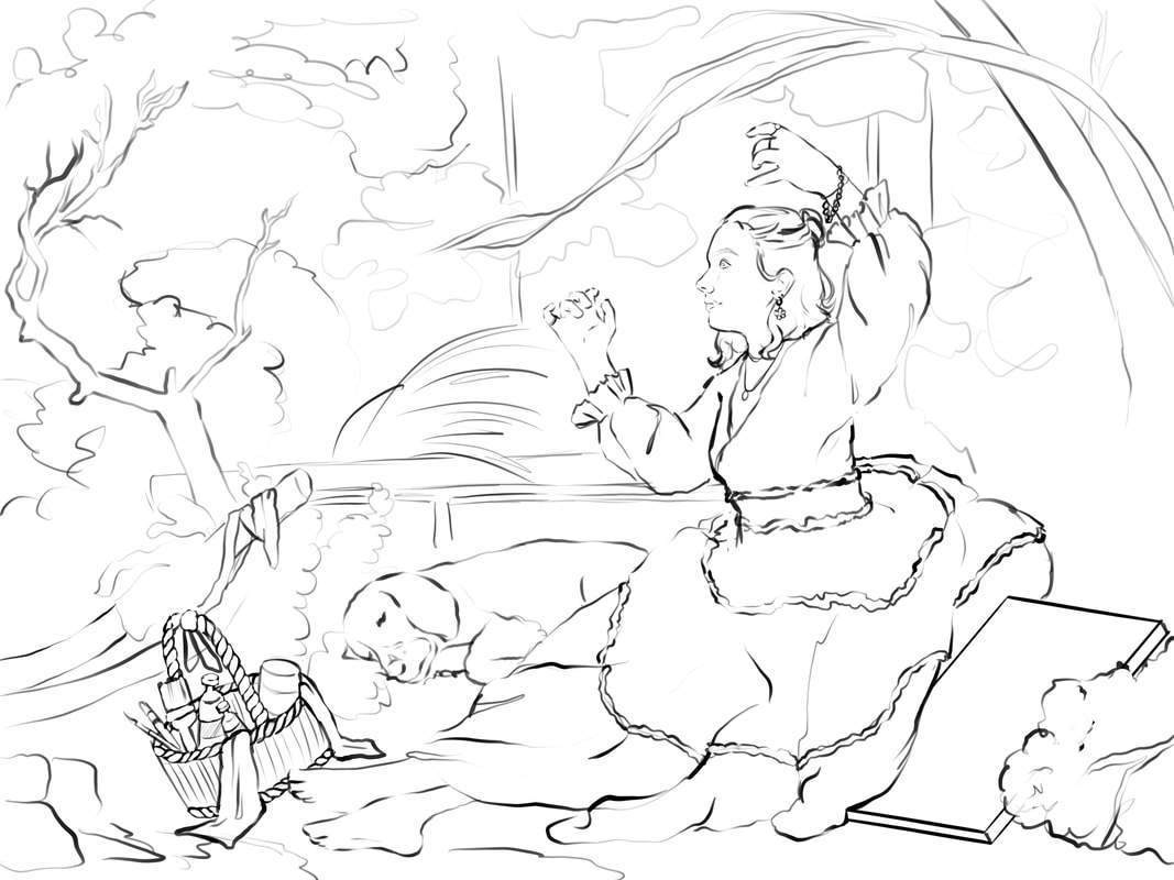
In order to begin the actual painting of this piece, I had to do a lot of extensive sketching and planning. The fact that I was just inserting myself into and already existing painting gave me an advantage and a disadvantage. On one hand, I didn't need to come up with ideas to cover every part of the canvas, and instead it was already decided for me. On the other hand, I had to make sure I took reference photos that where accurate to the image and I had to make sure they fit fairly accurately, otherwise the scale and perspective would look off. To start planning, I began with writing down all the things I wanted to keep and change, and what I wanted to change different things to. My plan was to keep most of the environment, such as the nature and building/structures, but change the figure, sheep, and a couple other things scattered around. For the figure, I changed it to myself and a dress that I have and like and I changed the sheep to my dog, Scout. I also changed around a lot of the surround objects, switching the flowers in the basket for painting supplies and the hat to a canvas. The idea is to create a dreamy environment that would feel peaceful and calming, and I did this by painting in the things that make me feel this way.
After getting my general idea down, I started on creating the final sketch. I first took a lot of reference pictures of the things that would be changed in the painting. This includes painting supplies, Scout, and most importantly, myself. I struggled a little with trying to take just one picture, and ended up finding it easier to take a lot of different ones that I would eventually put together. In doing this, I was able to focus on just one thing that I had to pose for, such as my face or hands, as opposed to making sure the entire photo was completely accurate. Once I had all the pieces to create the final sketch, I imported all the photos in Procreate and got to work. I cut out all the pieces of the pictures I took and resized them to match the original painting. Once the final reference image was complete, I created a canvas that was the same size as the one I would be painting on, and then transferred this image there. I traced it onto the blank canvas so that it would be a clean sketch as opposed to working only off of the general forms. Once this final sketch was done, it was time to transfer it to the final canvas. After doing this with a projector, I was ready to paint! |
Process :
PREPPING THE CANVAS
The first thing I needed to do in order to create this painting was stretching and prepping the canvas. My canvas is 3 ft x 4 ft, so I took two of each size frame pieces and put them together. I then stretched the canvas over this frame. After the canvas was created, I prepped it for painting with a couple layers of gesso. I started with just one, but went back in for a second so that the original texture of the canvas was smoothed out a little more. After gessoing, I picked out a couple of colors from my inspiration painting, and created very watered down versions of them. I covered the entire canvas in these paints, and it ended up sort of looking like water color. The reason I did this was to tone the canvas so that I was not painting on pure white, which helps me to be more accurate with color and value. It also serves as a good starting point as opposed to just a blank canvas.
The first thing I needed to do in order to create this painting was stretching and prepping the canvas. My canvas is 3 ft x 4 ft, so I took two of each size frame pieces and put them together. I then stretched the canvas over this frame. After the canvas was created, I prepped it for painting with a couple layers of gesso. I started with just one, but went back in for a second so that the original texture of the canvas was smoothed out a little more. After gessoing, I picked out a couple of colors from my inspiration painting, and created very watered down versions of them. I covered the entire canvas in these paints, and it ended up sort of looking like water color. The reason I did this was to tone the canvas so that I was not painting on pure white, which helps me to be more accurate with color and value. It also serves as a good starting point as opposed to just a blank canvas.


THE SKY (replace photo!)
When I finally got around to the painting process, the first section I started on was the sky. It is in the background, so I thought it would be easier to paint the mid-ground and foreground over top of it instead of vise versa. Using Fragonard's piece as a reference, I started with the lighter colors and worked my way darker. I used a separate brush for putting the colors down and for blending in an attempt to minimize muddy colors and help the process to go as smoothly as possible. One of things that stands out the most to me in Fragonard's piece is the smooth, seamless blending. In order to replicate this, I tried out a couple of different techniques until I found one that worked best for me. I originally had used just a clean filbert brush, mixing the colors on the painting until they eventually looked smooth. Although this did work somewhat decently, I found that it took a long time and still left some brushstrokes, which I was trying to avoid. What ended up working the best for me was a clean, dry, sort of fluffy brush. I was able to use this to blend by going over the paint in circular motions, making the sky appear less harsh. After going in with the brush dry for a little while, I would sometimes add a little bit of linseed oil to the brush, which I think just made the process a little smoother and allowed for an even softer transition.
When I finally got around to the painting process, the first section I started on was the sky. It is in the background, so I thought it would be easier to paint the mid-ground and foreground over top of it instead of vise versa. Using Fragonard's piece as a reference, I started with the lighter colors and worked my way darker. I used a separate brush for putting the colors down and for blending in an attempt to minimize muddy colors and help the process to go as smoothly as possible. One of things that stands out the most to me in Fragonard's piece is the smooth, seamless blending. In order to replicate this, I tried out a couple of different techniques until I found one that worked best for me. I originally had used just a clean filbert brush, mixing the colors on the painting until they eventually looked smooth. Although this did work somewhat decently, I found that it took a long time and still left some brushstrokes, which I was trying to avoid. What ended up working the best for me was a clean, dry, sort of fluffy brush. I was able to use this to blend by going over the paint in circular motions, making the sky appear less harsh. After going in with the brush dry for a little while, I would sometimes add a little bit of linseed oil to the brush, which I think just made the process a little smoother and allowed for an even softer transition.

THE FOLIAGE (BACKGROUND)
Fragonard's piece contains large amounts of plant life, nature, and foliage, which is one of the main things that drew me to it in the first place. I loved how blissful and lush everything appears, and I wanted to make sure to replicate it as best as I could. Since I was working from the background forward, the first step I took was creating the plants in the far back. These bushes and trees we much less detailed then the ones up front, and they instead seemed to almost be blended in with the sky. To create this effect in my piece, I ended up using a technique very similar to what I did in creating the sky. I put down the base colors, working from the light colors to the dark. I blended them together again with the larger fluffy brush, but this time made an attempt to make some texture. Though the colors are fairly smooth in blending, there is still some natural texture that is created due to them being bushes and leaves. Another aspect that differed from the sky was the layering. In the sky, there was little to no layers, other then the clouds. With the foliage, however, there was a lot of overlap from the different bushes, leaves, and other plants. To achieve this look, I would go through the blending steps as usual, and then I would create a sort of outline or border where the next layer would go. I usually used light colors against the shadows of the previous layer so that it would appear more realistic and as though one layer was behind the other.
Fragonard's piece contains large amounts of plant life, nature, and foliage, which is one of the main things that drew me to it in the first place. I loved how blissful and lush everything appears, and I wanted to make sure to replicate it as best as I could. Since I was working from the background forward, the first step I took was creating the plants in the far back. These bushes and trees we much less detailed then the ones up front, and they instead seemed to almost be blended in with the sky. To create this effect in my piece, I ended up using a technique very similar to what I did in creating the sky. I put down the base colors, working from the light colors to the dark. I blended them together again with the larger fluffy brush, but this time made an attempt to make some texture. Though the colors are fairly smooth in blending, there is still some natural texture that is created due to them being bushes and leaves. Another aspect that differed from the sky was the layering. In the sky, there was little to no layers, other then the clouds. With the foliage, however, there was a lot of overlap from the different bushes, leaves, and other plants. To achieve this look, I would go through the blending steps as usual, and then I would create a sort of outline or border where the next layer would go. I usually used light colors against the shadows of the previous layer so that it would appear more realistic and as though one layer was behind the other.

STRUCTURES / BUILDING
Behind the figure in Fragonard's painting, there are a few different structures. The ones that stand out the most are a shorter wall and what I can assume to be some sort of building. The colors are fairly neutral, with different tones of light brown or gray, contrasting from some of the bright and pastel colors throughout the piece. The first thing I did to paint this into my own piece was mix some different shades of gray, adding hints of blue, green, or red depending on where the color would go on the piece. I also paid a lot of attention to the value, as the building is partially in shadow and partially in the light. Because of this, I matched the value of the far left of the building to the leaves around it, and made it a little lighter. I found that the leaves served as a good reference point of value, as they were all around the painting, making it easier to be consistent and careful with the colors, tones, and values I chose. After mixing and picking out the colors, I started to lay them down where they are in the original painting. Since the left was darker, I started there, slowly blending the colors to the lighter side. On either side of the building, there is some sort of indent or something similar, so I made sure to pay attention to where those were so that I could create a similar sense of depth. I continued to paint the walls, focusing on the details and shifts in values until I eventually came out with something I was happy with, and I was done.
Behind the figure in Fragonard's painting, there are a few different structures. The ones that stand out the most are a shorter wall and what I can assume to be some sort of building. The colors are fairly neutral, with different tones of light brown or gray, contrasting from some of the bright and pastel colors throughout the piece. The first thing I did to paint this into my own piece was mix some different shades of gray, adding hints of blue, green, or red depending on where the color would go on the piece. I also paid a lot of attention to the value, as the building is partially in shadow and partially in the light. Because of this, I matched the value of the far left of the building to the leaves around it, and made it a little lighter. I found that the leaves served as a good reference point of value, as they were all around the painting, making it easier to be consistent and careful with the colors, tones, and values I chose. After mixing and picking out the colors, I started to lay them down where they are in the original painting. Since the left was darker, I started there, slowly blending the colors to the lighter side. On either side of the building, there is some sort of indent or something similar, so I made sure to pay attention to where those were so that I could create a similar sense of depth. I continued to paint the walls, focusing on the details and shifts in values until I eventually came out with something I was happy with, and I was done.
THE FOLIAGE (FOREGROUND)
The foliage in the foreground was quite a bit more detailed then what was in the background, with lots of individual flowers, leaves, and branches. Although it was more detailed, the process ended up being pretty similar with only a few additional steps. I started by mapping out where I wanted the foliage to go by taking a very general color that was darker than what the leaves would be in the end and blocking out in bush shaped blobs. I added a little variation in color during this stage, but mostly focused on that later. I ended up leaving these be while I was working on other parts until it dried. Once it did, I mixed two or three main colors for each section of foliage, and then make slight hue and value variations from those main colors so that I had a lot of options to work with. Mixing them from the same base helped it to be more cohesive and allowed for more variation and natural looking plants. With these colors, I painted general leaf shapes over top of the dark blobs I had painted a couple days before. Having the dark background allowed the leaves to stand out without requiring me to individually detail and shade each one. Although I did want them to be detailed and obviously leaves, I didn't want them to be the main focus of the viewers attention. I was able to find a good middle ground with this technique, and repeated it throughout the painting in all the places that needed it.
The foliage in the foreground was quite a bit more detailed then what was in the background, with lots of individual flowers, leaves, and branches. Although it was more detailed, the process ended up being pretty similar with only a few additional steps. I started by mapping out where I wanted the foliage to go by taking a very general color that was darker than what the leaves would be in the end and blocking out in bush shaped blobs. I added a little variation in color during this stage, but mostly focused on that later. I ended up leaving these be while I was working on other parts until it dried. Once it did, I mixed two or three main colors for each section of foliage, and then make slight hue and value variations from those main colors so that I had a lot of options to work with. Mixing them from the same base helped it to be more cohesive and allowed for more variation and natural looking plants. With these colors, I painted general leaf shapes over top of the dark blobs I had painted a couple days before. Having the dark background allowed the leaves to stand out without requiring me to individually detail and shade each one. Although I did want them to be detailed and obviously leaves, I didn't want them to be the main focus of the viewers attention. I was able to find a good middle ground with this technique, and repeated it throughout the painting in all the places that needed it.


|
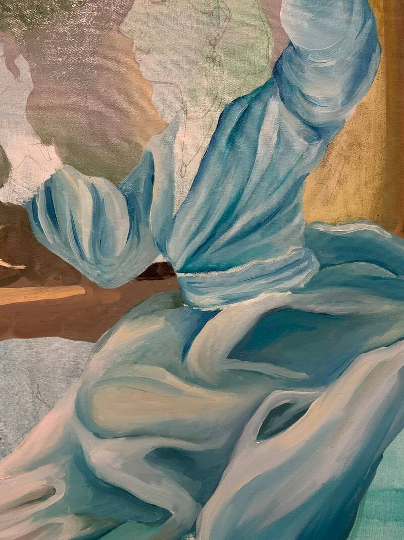
DRESS
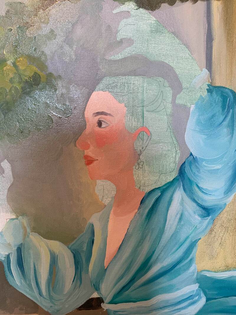
One thing that I struggled the most with this piece was painting the dress. The way Fragonard paints the dress onto his figure shows its dynamic and flowing form, and I wasn't sure exactly how to execute this. I ended up just jumping in and changing my techniques as I went, and it ended up working okay. As opposed to the original piece, the dress in my painting is all one color with a pattern over top of it. I struggled a lot with figuring out to go about it, and I'm not entirely happy with the outcome, but I definitely learned a lot in the process. To start, I came up with my color palette, which was mostly white and light blues. At first, I couldn't really figure out how to |
|
|
SELF PORTRAIT PART
Going about painting myself was a little tricky, mostly because I didn't really know where to start. I eventually decided to start with the skin, more specifically the face. To do this, I mixed four or five different colors which consisted of a mid tone, shadow, and highlight color, as well as a couple blushy colors to use on the cheeks, hands, etc. I payed a lot of attention to Fragonard's piece as I began painting the face, specifically to the values. I altered my skin tone a little from the figure in the original painting as she was much more pale than I am, but the areas where the shadows and highlights were still stayed the same. I started by blocking out the main sections of light, not focusing on blending yet. I also blocked in the general shape of the facial features, like my eyes, eyebrows, and mouth. I was able to use these features as a sort of map for where the colors go, as I was able to look at the original painting and see where different values where in relation to the facial features, even if the faces are not the same. After I had these colors is when I started blending and adding more detail. I adjusted the hues in different colors based on where they are on the face, and used a detail brush to add things like the corner of the mouth, the ear, and eyelashes. I didn't have any specific technique to getting this done, and mainly just tried different colors and different hard and soft edges until it looked the way I wanted. I repeated this process similarly in the neck, hands, and feet. For the hands specifically, Fragonard's painting depicted them as very red, which I wanted to replicate in my own. To do this, I took the colors from the face and added red to them. Since they were all a similar hue, I found that there was a lack of contrast, which I avoided by adding blues and browns so that the colors still looked red but had more apparent shadows and highlights. I did find the hands a little difficult to navigate, as the details where a lot more important as they were what would tell the fingers apart from each other and the palm. I started with the darkest colors and worker lighter, which helped me place the shadows and use them as sort of guidelines to where everything else should go. For here, I used similar blending techniques to what I did in the face, and eventually got to the finished product. The last thing I needed to finalize was the hair, which I worked on a little bit at a time as I was painting the skin. My hair is pink with super grown out roots, so I had to make sure I had multiple versions of each of the two colors that would work well to be blended together. Since it is lighter in color, I started with the pink ends and worked my way up. I didn't really have a strategy going into it, but eventually settled on painting the shadows first and then the highlights. This helped the lighter colors to stand out as opposed being overpowered by the shadows, which tends to happen when I do it in the opposite order. I did the same thing for the brown part of my hair. For the part where the two colors meet, I just switched off between colors until it looked naturally blended, but not to the point where it looked airbrushed or super soft. I wanted to make the the texture was still present, while also incorporating the two colors. Once everything was done, I only had a few more things to add to the painting, and moved onto the last details. |
OTHER
Finally, I was down to the last finishing touches. This mainly consisted of the basket, ribbon, canvas, and my dog. It was a fairly simple process to go about, and I started with the basket and ribbon. As opposed to the flowers in the original painting, I replaced them with painting supplies. I did end up keeping some flowers, mainly to fill some of the empty space. To paint the basket it all sat in, I started with a dark base color, and then added a lighter color on top to highlight the detail in the weaving. For the painting supplies themselves, I references a lot of the supplies I had around me while I was working, focusing on the shapes and form and how the lighting reflected this. The things I added included paint brushes, paint tubes, a water can, and a paper towel, among some others. After the basket, I worked on the cavas. I wanted the canvas to be blank, contrasting to the highly detailed background. I liked having the empty space, something that looked like it was ready to be painted on, sort of like a new beginning. This was pretty simple, as it was all one color. I just painted the area the whitish color, shading when needed. The very last element I added to this painting was my dog Scout. I found the process similar to a combination of painting my hair and some of the background. I started by creating guidelines as to where I would block out the colors, since he has white and brown fur. After this, I worked on the face, painting in the darker parts and working lighter. Although I wanted the blending to be smooth, I did want to make sure the texture of the fur was still there. To achieve this, I made sure to add individual strands of hair here and there, and make the values blend together in a similar way as the way I did the hair. I repeated these same steps on the white fur, and added the last details. Scout has a lot of tiny brown spots on his white hair, and I wanted to make sure I included this before finally finishing the whole painting.
Finally, I was down to the last finishing touches. This mainly consisted of the basket, ribbon, canvas, and my dog. It was a fairly simple process to go about, and I started with the basket and ribbon. As opposed to the flowers in the original painting, I replaced them with painting supplies. I did end up keeping some flowers, mainly to fill some of the empty space. To paint the basket it all sat in, I started with a dark base color, and then added a lighter color on top to highlight the detail in the weaving. For the painting supplies themselves, I references a lot of the supplies I had around me while I was working, focusing on the shapes and form and how the lighting reflected this. The things I added included paint brushes, paint tubes, a water can, and a paper towel, among some others. After the basket, I worked on the cavas. I wanted the canvas to be blank, contrasting to the highly detailed background. I liked having the empty space, something that looked like it was ready to be painted on, sort of like a new beginning. This was pretty simple, as it was all one color. I just painted the area the whitish color, shading when needed. The very last element I added to this painting was my dog Scout. I found the process similar to a combination of painting my hair and some of the background. I started by creating guidelines as to where I would block out the colors, since he has white and brown fur. After this, I worked on the face, painting in the darker parts and working lighter. Although I wanted the blending to be smooth, I did want to make sure the texture of the fur was still there. To achieve this, I made sure to add individual strands of hair here and there, and make the values blend together in a similar way as the way I did the hair. I repeated these same steps on the white fur, and added the last details. Scout has a lot of tiny brown spots on his white hair, and I wanted to make sure I included this before finally finishing the whole painting.


Experimentation :
This piece required a lot of experimentation, particularly in the creation of the background and fabric. While painting different elements of the background, primarily the plant parts, I struggled a lot with finding ways to imply the textures similar to how they are shown in the original painting. With the bushes and branches, I had originally started by painting each leaf on in the place I thought they should go, but found that I couldn't get any sort of depth or dimension unless I individually went into each one and added shadows and highlights to them. This would have taken far too long considering how many leaves and groups of them there were, so I was left to come up with a more efficient solution. From this, I came up with the idea of painting the general area where the leaves would go in a dark colored blob. Next, I would let these areas dry so that I would be able to paint on top of them without the next layer blending into the first, causing the colors to become muddy. After the layer was dry, I mixed a couple different lighter leaf colors and began painting the leaf shaped on top of the darker color, adding more detail as I went. This process was much more time efficient then the first, and I think it ended up looking better as well. Instead of soft edges and blending due to the painting mixing together, the edges of each leaf was much more defined and sharp, which is the look I was going after.
Another element of this painting I had to experiment with was the fabric parts, primarily the dress. I had a really hard time figuring out how the shadows and highlights worked in relation to the form, and struggled to find a way to accurately paint it. I started the process by just guessing where everything went, but found this to be ineffective. Although I did have pencil guidelines, it was hard to use just these to work off of, as they were starting to fade and overall just super general in their placement. In order to get past this, I decided to take one of my shadow colors and draw in where the specific creases, folds, and forms were. It was difficult to map out at first, but as soon as I had placed some of the main distinct lines, it became much easier to figure out where the smaller, more detailed ones where in relation. Using these newer guidelines, I found it much easier to paint the different folds and creases. From here, it was mostly just a matter of looking at Fragonard's piece and back at my own, comparing the highlights and shadows until it was eventually finished.
Another element of this painting I had to experiment with was the fabric parts, primarily the dress. I had a really hard time figuring out how the shadows and highlights worked in relation to the form, and struggled to find a way to accurately paint it. I started the process by just guessing where everything went, but found this to be ineffective. Although I did have pencil guidelines, it was hard to use just these to work off of, as they were starting to fade and overall just super general in their placement. In order to get past this, I decided to take one of my shadow colors and draw in where the specific creases, folds, and forms were. It was difficult to map out at first, but as soon as I had placed some of the main distinct lines, it became much easier to figure out where the smaller, more detailed ones where in relation. Using these newer guidelines, I found it much easier to paint the different folds and creases. From here, it was mostly just a matter of looking at Fragonard's piece and back at my own, comparing the highlights and shadows until it was eventually finished.


Critique :
For the critique, I will be comparing my own piece to "The Shepherdess" by Jean-Honore Fragonard
Similarities May Include :
- The composition is replicated from the original onto my own piece. To create my painting, I used the same composition as Fragonard painting, but with myself and my own objects. In doing this, I kept the same blissful and peaceful feeling, while implementing things that make me feel that way.
- Nature filled background. The background of my artwork is the same as Fragonard's, as I wanted to create the same natural backdrop. I loved the way that it looked like she was in the middle of nowhere, and wanted this to carry into my own piece.
- Smooth and soft blending techniques. When I painting, I made sure to look back at Fragonard's so that I could stay as accurate to his blending style as possible. I tried a lot of different techniques so that I would be able to show the way his painting looks soft, while still implying the textures of different elements.


Differences May Include :
- The main subject matter. The most obvious difference between the pieces is the figure, who I replaced with myself, hence this being a self portrait. I changed the clothing to a modified version of a dress I own, and changed little things like the hairstyle and the pose very slightly.
- The color palette and values. Although the colors are relatively similar, mine tended to be a little bit brighter and have less contrast. Fragonard's, on the other hand, had still light colors, but more muted and with higher contrast of values.
- Various objects around the scene. Throughout Fragonard's painting, there are things like flowers, a hat, and some sheep. For mine, I replaced these with my own objects, like painting supplies, a canvas, and my dog.
Reflection :
Throughout the process of creating this painting, I learned a lot and built upon a lot of the skills I have been developing for the past while. Having started this painting in December, I had a lot of time to experiment with different techniques and figure out what works best for myself and the piece altogether. My inspiration for this piece was "The Shepherdess" by Jean-Honore Fragonard. I was immediately drawn to the light pastel colors and peaceful setting, and essentially recreated it with myself as the subject, surrounded by the things that I love. I wanted to recreate the feeling of bliss and happiness, and did this by portraying myself with things like art supplies, nature, and my dog, all things that put me at ease and make me happy.The biggest challenge I faced in creating this paining was the fabric. I was basing the dress I painted on the dress in the original painting, but changes the style and colors. Because of this, I was able to attempt to replicate the same fold and forms in the original paintings dress. I found it very difficult to look at different parts of the fabric and pinpoint where they should go and what they should look like. Although I was eventually able to get it to look the way I wanted, I was definitely a struggle. This piece tied together with previous projects, especially ones like the tryptic, since I was working at a large scale in oil paint. I've also done some of my own paintings using oil, primarily portraits, which helped a lot in applying those techniques to when I eventually had to paint the skin. I think my favorite part of this piece is the background, both the finished painting and the process that went into it. I had a really fun time figuring out what techniques to use and how to apply them to create different the textures that were needed for the different elements of nature. I also really enjoyed the different colors I was able to use. I focused a lot on making the colors bright and vivid, similar to how they were in the original, and I think this paid off in the end with the final product. In conclusion, I want people to look at my piece and see the things that make me happy and feel at peace. Art is something that I use sort of as a therapy, and I really want that to be reflected through this painting.
ACT Questions :
Clearly explain how you are able to identify the cause effect relationship between your inspiration and its effect on your artwork?
What is the overall approach the author has regarding the topic of your inspiration?
What kind of generalizations and conclusions have you discovered about people, ideas, culture, etc. while you researched your inspiration?
What is the central idea or theme around your inspirational research?.
What kind of inferences did you make while reading your research?
Citations (in MLA Format)
https://blog.mam.org/2010/10/17/from-the-collection-jean-honore-fragonard-the-shepherdess/
